22 Sep

Introducing My Latest Projects

… Or, How to Procrastinate Productively.

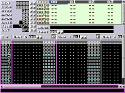
klystrack3

I decided to make one of my current projects open source and post them on Google Code just for fun. The project is a tool chain that I’m using to remake Thrust. In reality, I decided to divide the project into two separate projects: the actual game engine (called klystron) and related tools, and a music editor that uses the engine.

Here are two videos I made a while ago that demonstrate the engine. The first is the music editor (called klystrack) — it’s much less ugly at the moment but the sound synthesis is the same, and that’s what matters:

The sound engine (“Cyd”) is basically a very simple software synthesizer with capabilities comparable to the SID or any 8-bit machine from the 80s. The editor is a fairly standard tracker, much like GoatTracker.

The graphics half of the engine is basically a wrapper around a quite fast collision detection system (pixel-accurate, or it wouldn’t be much good for a thrustlike) built on SDL. It also does background collisions and drawing as well. As you may have guessed, the whole point is to provide a limited but still helpful set of routines that are useful for creating 2D games not unlike what video games were in 1991.

And, here’s a proof I’m actually working on the actual game (the sound effects are created in real time by the sound engine):

A note on Google Code: it’s rather nice. It provides the standard open source development stuff like source control an such but I really like how clean and hassle-free it is. Adding a project takes a minute and after that it’s simply coding and some quick documentation on the project wiki. The project wiki is good example of how simple but elegant the system is: the wiki pages actually exists inside the source control as files, just like your source code.

Go check Google Code out and while you’re at it, contribute on my projects. :)
08 Sep

You Can Stop Programming Now

The above is puls, a 256-byte intro by ?r?ola. It’s basically a raytracer with screen space ambient occlusion (which makes it so much realistic and cooler). While tube — which I think was the best 256-byte intro until now (when design and code are judged together) — also did raytracing of a cylinders, and after that many other intros did similar tracing of more complex surfaces, puls simply crushes all of them with objects that are formed by multiple plane surfaces (e.g. a cube would be a combination of six intersecting planes), a very nice color palette and that delicious ambient occlusion.

Thinking it out in C and sketching it out in asm took about a week, byte crunching took another one… that’s like forty hours of full focus and eighty of playing.

It’s also really, really slow which is the only minus especially because you can’t run 16-bit executables on Windows 7, so you have to use DOSBox to watch it (or, use a boot floppy to run it or something). There’s now a Windows port including a screensaver, see the Pouet.net page for more. A big thank you to nordak5 who was kind enough to upload a video on Youtube.

?r?ola has also included source code with the binary that you can find over here. That said, I’ll be deleting all my own source code since perfection has finally been achieved and there is no need for programmers anymore.

02 Sep

Retargeting Images Using Parallax

I came up with a neat way to retarget images using a mesh that is transformed by rotating and doing an ortographic (non-perspective) projection. This is generally quite interesting since it can be done using a mesh and simple transformations and so can be done almost completely on the GPU. Even using a mesh can be avoided if one uses a height map à la parallax mapping to alter the texture coordinates so just one quad needs to be drawn (with a suitable fragment shader, of course).

The idea is simply to have areas of images at a slope depending of how much the areas should be resized when retargeting. The slope angle depends of from what angle the source image is viewed to get the retargeting effect since the idea is to eliminate the viewing angle using the slope.

Here’s a more detailed explanation:

  1. Create an energy map of the source image, areas of interest have high energy

  2. Traverse the energy map horizontally accumulating the energy value of the current pixel and the accumulated sum from the previous pixel

  3. Repeat the previous step vertically using the accumulated map from the previous step. The accumulated energy map now “grows” from the upper left corner to the lower right corner. You may need a lot of precision for the map

  4. Create a mesh with the x and y coordinates of each vertex encoding the coordinates of the source image (and thus also the texture coordinates) and the z coordinate encoding the accumulated energy. The idea is to have all areas of interest at a steep slope and other areas with little or no slope

  5. Draw the mesh with ortographic projection, using depth testing and textured with the source image

  6. Rotate the mesh around the Y axis to retarget image horizontally and around the X axis to retarget image vertically

Here is a one-dimensional example (sorry for the awful images):

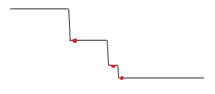
Source image

Source image

The red dots represent areas of interest, such as sharp edges that we don’t want to resize as much as we want to resize the areas between the details. We then elevate our line for every red dot:

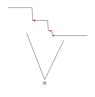
red-dots

Elevated mesh

Imagine the above example as something you would do for every row and column of a two-dimensional image. Now, when the viewer views the mesh (which is drawn without perspective) he or she sees the original image:

red-dots3

Viewing the mesh from zero angle

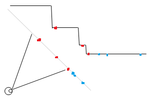
However, if the viewing angle is changed, the red dots don’t move in relation to each other as much as the areas that are not elevated when they are projected on the view plane. Consider the below example:

red-dots3

Viewing the mesh from an angle (gray line is the projected mesh)

Note how the unelevated line segments will seem shorter from the viewer’s perspective while the distance between the red dots is closer to the original distance. The blue dots in the above image show how areas that have little energy and so are not on a slope, thus will be move more compared to the red dots.

01 Sep

Better Tag Cloud for WordPress

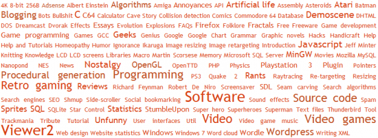
The original way how WordPress sizes the tags in the tag cloud is a bit bad: if you have one tag that is used a lot, e.g. for every post, it makes all other tags too small to have any variance when compared to other less popular tags. I changed the way WordPress determines the size, get the patch here. It is also possible to define your own scaling algorithm, see the patch for more information.

This is how WordPress shows the cloud as of version 2.8.4

This is how WordPress shows the cloud as of version 2.8.4

This is how the cloud is changed by my patch

This is how the cloud is changed by my patch