03 Sep

What to do when Catalyst Control Center won’t load?

Short answer: replace CCC with ATI Tray Tools. The software has the most common stuff like setting anti-alias options and resolution and lots more for tweaking. And it’s very light-weight in comparison.

In my case, I wanted to disable forced anti-aliasing so that the enemy outlines in World of Tanks were visible. A well-known bug in the game with a working solution, but an another well-known “feature” in the video software made working around it impossible as I couldn’t access the video settings.

The most dorky thing with CCC is that while there’s a ton of trouble with it, it seems the install procedure is the real reason for it not working. In my case, it was probably because of missing libraries and so the software refused to start (the only hint was an error message in Event Viewer: Could not find Type [ATI.ACE.CLI.Component.Dashboard.Dashboard] from [CLI.Component.Dashboard]).

Many tutorials on how to fix this is to reinstall CCC and the drivers but I found this won’t work and is very annoying even if it did work. So, I recommend skipping that and use this little tool instead. Thank you Ray Adams, no thanks ATI/AMD.

27 Jun

Proposal: One-sentence News

Stop luring people on your trite news blogs with misleading titles. Sure, a mysterious or provocative title is a good way to get people interested, but it in worst case makes your blog (and you) look uninformed. Especially, when the first sentence of the news item doesn’t explain the inaccuracies of the main headline.

News should never be speculative and if that is the case, it has to be explicitly stated where the line between fact and fiction goes. Some news are meant to be taken as entertainment but that style of writing should not bleed to potentially important news items. At least I expect to get information from news, even if I just casually pick the interesting sounding ones.

I hereby give away another priceless idea: one-sentence news. That is, you do not need to read the full article after you have read the descriptive, 5-15 word headline. Maybe that’ll cut into the advertising profit for there are less visitors to your site from feed readers etc. but not providing full articles in a feed is yesterday. And if you really only write 20 words per article, well, I guess that could make it profitable if you divide your income by the amount of text you write.

Here’s an example: Popular Science reports “Genetic Material Found on Meteorite“. What went wrong? Take a guess. At the very least I expect to read about scientists finding very discriminating evidence on a meteorite with a blacklight, kinda like how they do it with dead hookers in CSI.

Even the subtitle right below the main title already downplays the sensational title and states “A meteorite in Australia has been found to contain component molecules of DNA”. And if you take the time to read the article, you’ll learn similar molecules that make up DNA are found on a meteorite (I bet a rather large percent of the molecules in your DNA most likely are entirely made on Earth). That’s like reporting there are organic molecules in space (look it up), and not explaining what “organic” actually means. Except in the end, right below the ad banner.

How could that be reported in one sentence and what are the benefits? First, you’ll deliver the exact same amount of information but quicker. “Similar Molecules as in Your DNA Found on a Meteorite”. “The Birth of DNA Molecules Could Have Been Helped by Completely Uninteresting Stuff on Meteorites Billions of Years Ago”. Hell, I don’t care if it’s a haiku. Just make it terse, informative and less stupid.

01 Apr

Get your act together, Mozilla

dailyApps writes:

Mozilla has finally lifted the curtains off Mozilla Addons that has a completely has a shiny new look and is simply amazing at the first sight
[…]
What do you think about the new Mozilla Addons site?

Frankly, I think it sucks.

I had to reinstall Firefox and when trying to download all the old addons I used to have, the dreaded addons site stopped the process instantly. First, I had to create a user for a site I have used for years with great ease.

Usually, I wouldn’t even think twice about that but I don’t have the Bugmenot addon installed because I have to log in the site first to download it. I went ahead and saw the trouble of typing in the information and checking my mail for a confirmation email and so on.

I found an addon I need and click the install button on the page, which has to this point been a two-or-three-click deal. Next thing I see is a completely nonsensical and technical error message (one with an error code with no explanation — on top of it all it was a negative number). I had to right click and save the XPI package on the disk in order to realize it’s actually a web page explaining the error I encountered.

The add-on you’re looking for is in the sandbox, which you do not have enabled in your user preferences.

Guess where the option is? Not anywhere near the user preferences. In fact, I can’t find it anywhere. And, I don’t really feel like reading through a forum or a well-hidden FAQ.

If a dedicated Firefox user like me can barely find enough energy to fight through the mess that the new site is, how can they assure the common surfer that addons aren’t that big of a hassle? Sure, the new site might be somewhat safer and somewhat less threatening to the normal visitor but that doesn’t mean it has to be an annoyance for everyone else. Also, I don’t care if this is just a temporary quirk.

At least Firefox 3.0 seems quite promising. Though, I can’t really agree with all of the thousands of blogs that are completely flabbergasted of the fact the next shipped release actually works. Or, that the bookmarking system doesn’t suck balls as much as the current thing.
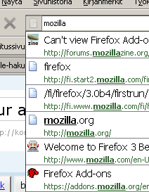
I think the new user interface has some clever realizations. For example, the two drop down menus that are usually located next to the forward and back buttons have been combined into one menu. It simply has items above (forward in time) and below (backward in time) the current page that is highlighted in the middle. I also think the “Smart Bookmarks” (something that remembers the most visited pages) are a good idea, the most visited pages generally are the same pages as the pages in your bookmarks.

However, I think 3.0 also has some mistakes in the new features. While it’s great you can search the browser history simply by typing in words in the location bar, I think it’s not that clever that it’s always the page title that is the largest part of the results — I bet most users are very used to seeing addresses in there since it’s originally the address bar.

Also, there still is an annoyance I have wished didn’t exist since version 1.0. You can try it yourself: go to e.g. Google, move your mouse just a bit below the query field and type in the beginning of a query. Now, since Firefox remembers earlier form data it will show a drop down list of earlier searches. The catch is that since the mouse hovers over the drop down list, pressing enter will not submit the form but select the item that the mouse is hovering over. Not fatal but it can very annoying (everyone has to agree to some extent, any lost data is at least just a bit annoying).

Anyway, Mr. Mozilla, call me when you have removed the silly stuff from the addon site. Kthx.

29 May

Webdesign stuff that annoys me

Here are some annoyances I still encounter in the Web even though I’m sure they have been featured in rants since the WWW was introduced to the masses (an event somewhat similar to when Titanic was introduced to frozen water).

  1. Checkboxes that aren’t linked to the actual text so you can’t click on the text to check the box. I can only imagine how much this annoys people who actually have a physical handicap. Or, are drunk. Which I can imagine very well.

  2. Pages that don’t have a descriptive title. Come on, people. It’s about time to adopt this groundbreaking new technology. Also, try to make the title descriptive even if there are only the first 30 or so letters visible because you can’t fit everything on a tab title bar that you can fit on the window title bar. For example, have the subpage title first and then your homepage title.

  3. Text links that look the same whether if you have visited them or not. There is a reason why they should look different: computers are tools made for us stupid, stupid people so they can act a bit less stupid. In my case my computer tends to remember things better than me so it’s nice when once in a while it reminds me I have clicked a link already during the past few weeks.

  4. Text links that look just like normal text. No, I don’t have the time to check every piece of underlined text for links. Better leave the links either underlined or blue, that way most people automatically associate them to text links (because, like, in the old-school interwebs the text links were blue and underlined — always).

  5. Pages that change the mouse pointer without any good reason. Yes, there are different pointers available but they exist only to offer information to the user. And you can’t even click properly that pixel size 5 text (very often seen with other shitty design traits) with a hourglass pointer.

  6. Links used to trigger JavaScript that have the onClick attribute set but also have the href attribute set to “#”. You should put the href point to “javascript:yourFunction()”. I don’t care if that’s some voodoo to make it work on IE, it still annoys the hell out of me when clicking something that should open a popup or something also makes the browser scroll the page to the top.

  7. Usage of new “Web 2.0” techniques to push usability back to Web 0.5. Yes, it’s really nice if you can fade the page black and show an image over it. Even though that also makes the image not display progressively as it loads and generally overrides how the browser would show it. OK, it’s not really nice, it’s stupid.

  8. Finally, the most annoying thing is that the people who are guilty of the above most likely make more money than me.