30 Jul

Helium pitch-shifter

Would this work?

pitchshifter.png

Maybe the tank needs to be upright and filled with helium and some other gas half and half, so there’s a difference in gas density, which compresses the sound waves making the pitch higher. Like this:
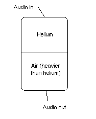
pitch2.png

Of course, some other gases could be used for different effects. I think using a combination that would make the pitch lower would result in clean shifting, a situation where there tends to be a lot of phasing. Then again the acoustics of the tank would have to be perfect. But let me think I invented something really clever at least for a while, OK?

20 Jul

Stuff I’d like to see in every user interface

Here’s something that I think would be very nice to have as a standard feature in all user interfaces. I don’t know how much of it has been already implemented in various interfaces out there but I have tried to add an example if I know of any.

Common UI stuff

  • Universal search. You should be able to search any dialog with a lot of text. I use this feature a lot on web interfaces, thanks to the search feature in any web browser. You almost never use every bit of information in a dialog, so this speeds things up a lot.

    There should be an search function that looked into all the menus and dialogs and told you where that elusive checkbox is. E.g. in a web browser you would type in “Accept cookies” and it would tell you it is in Tools>Options>Privacy.

    Google’s, Yahoo’s and other developers’ desktop searches are a step in this direction but they don’t offer that much new. Google Desktop does have a very handy search dialog (double click the Ctrl-key and the search box is summoned – priceless). However, none of the desktop search software I have seen ever is both nice to use and feature rich. Google’s software surprisingly is much worse to use than the web search when you do anything more complex than just check where a file is (and you know its exact filename).

  • Fuzziness. Everything involving user input should have an amount of fuzziness built-in. People make mistakes, computers don’t. Which results in when a computer uses data from a user, it is only as good as the user.

    For example, that search feature I rambled about above could return the exact result and then a list of items that contain the word “cookie” or a synonym to “accept”. That way the dialog box could have the text “Allow cookies” and it still would be in the search results. You have seen this in action when using Google or a word processor with spell checking (they tend to suggest proper spelling and other near matches).

    The user shouldn’t ever have to put in exact dates, sizes or types. Nor should the program treat dates as absolute values. E.g. when searching for a file created two weeks ago, the program should find also files that were created three weeks ago (in case you remember the date wrong), especially if there weren’t any files created two weeks ago.

    I have to add this does not necessarily make things less accurate. You would still have the best matches first or that the software would only use fuzziness when it can’t find anything with the exact information. And when deleting files or doing something as critical, it would never delete files it thinks are sufficiently similar, obviously.

GUI stuff

  • Pie menus. These should replace the now common hierarchial context menu, they tend to grow very annoying to browse through. It’s because a normal menu usually closes when you move the mouse outside the menu, this means the screen has something like 90% worth of area that closes the menu. A pie menu usually needs a click on the center to close the menu, which is something like 10% of the area. Also, a pie menu is faster to use thanks to muscle memory (you generally select things by the direction, not by the amount of rows you have to move up or down).

    Even though I have played enough video games to have some hand-eye coordination, it is tiresome to use that skill for opening a simple menu (as a side note: The Sims has pie menus which leads me into thinking most people would like to have those outside the game, too).

  • Zoom. You should be able to zoom in and out everything. This includes even text-only information. Imagine how nice it would be to zoom the desktop out to see every window at once. Or, to browse a huge list when you first zoom it 50% out, so that you effectively have twice the amount of information on the screen at once (which doesn’t really slow down skimming). This is easy now that practically every home computer has 3D-acceleration (and enough CPU power too, for rendering vector text on the fly etc.).

    You can see something like this in the beginning of this video. And it really doesn’t even have to be that elaborate. I actually have experimented with this myself in my image viewer, if you mind a little plug.

  • In all, I think most GUI designers should play more games. Video games rely on fast and accurate action and extremely usable interfaces; I think video games are the kind of software that receive most of the criticism when it comes to crappy user interface. While games are about leisure and competition and other software usually isn’t, it doesn’t mean all other software should be clumsy to use and not designed for minimal interface friction.
  • Temporal data on buttons. Buttons should have for example a slight color change if you have clicked it recently. Web browsers do this to visited links. I often have a bunch of console windows open and on the taskbar and in the Alt+Tab menu they all look the same. If they were colored according to the time they have been open or so, I could immediately see in which one I was just working.

    The Windows Start menu does something like this but it’s quite annoying because it hides all items that weren’t just used (it’s very annoying to use otherwise, too – see the rant about pie menus above).

Misc. features

  • Non-permanent pause. A pause feature should have some kind of optional time limit. I often click “pause all” on µtorrent when I want to watch a streaming video or so, and then forget to resume the downloads after I don’t need the extra bandwidth. There should be a “pause for 15 minutes” style option. Google Desktop has this feature and I think it’s very nicely thought considering you want to continue the indexing ASAP.
10 Jun

Five efficient ways to cripple your awesome Firefox extension

  1. Make sure the extension crashes the browser even if just once a week. What will your fellow developers say of you if you even can’t crash the environment with pure JavaScript? It’s sometimes enough if the extension simply doesn’t work.

  2. Stuff everything — and I mean everything — inside the right click context menu. Or, in fact you can add your menu items anywhere as long as it’s not that convenient for the user. Forget about nice buttons the user could move around in the toolbar.

  3. Keep the usual GUI design rules in mind. For example, if your feature is called, say, “dTaOneClick“, make sure the user can’t really just click once but maybe twice. No keyboard shortcuts allowed.

  4. Forget about other extensions. And stuff even more things inside the context menu with useless descriptions. Do not group your menu stuff inside a submenu.

  5. Never continue supporting your extension. After all, every Firefox user wants to install Nightly Tester Tools to be able to use your extension after a critical update from 2.0.0.3 to 2.0.0.4.

29 May

Webdesign stuff that annoys me

Here are some annoyances I still encounter in the Web even though I’m sure they have been featured in rants since the WWW was introduced to the masses (an event somewhat similar to when Titanic was introduced to frozen water).

  1. Checkboxes that aren’t linked to the actual text so you can’t click on the text to check the box. I can only imagine how much this annoys people who actually have a physical handicap. Or, are drunk. Which I can imagine very well.

  2. Pages that don’t have a descriptive title. Come on, people. It’s about time to adopt this groundbreaking new technology. Also, try to make the title descriptive even if there are only the first 30 or so letters visible because you can’t fit everything on a tab title bar that you can fit on the window title bar. For example, have the subpage title first and then your homepage title.

  3. Text links that look the same whether if you have visited them or not. There is a reason why they should look different: computers are tools made for us stupid, stupid people so they can act a bit less stupid. In my case my computer tends to remember things better than me so it’s nice when once in a while it reminds me I have clicked a link already during the past few weeks.

  4. Text links that look just like normal text. No, I don’t have the time to check every piece of underlined text for links. Better leave the links either underlined or blue, that way most people automatically associate them to text links (because, like, in the old-school interwebs the text links were blue and underlined — always).

  5. Pages that change the mouse pointer without any good reason. Yes, there are different pointers available but they exist only to offer information to the user. And you can’t even click properly that pixel size 5 text (very often seen with other shitty design traits) with a hourglass pointer.

  6. Links used to trigger JavaScript that have the onClick attribute set but also have the href attribute set to “#”. You should put the href point to “javascript:yourFunction()”. I don’t care if that’s some voodoo to make it work on IE, it still annoys the hell out of me when clicking something that should open a popup or something also makes the browser scroll the page to the top.

  7. Usage of new “Web 2.0” techniques to push usability back to Web 0.5. Yes, it’s really nice if you can fade the page black and show an image over it. Even though that also makes the image not display progressively as it loads and generally overrides how the browser would show it. OK, it’s not really nice, it’s stupid.

  8. Finally, the most annoying thing is that the people who are guilty of the above most likely make more money than me.

14 May

-mthreads, -mthreads, -mthreads…

This falls in the obvious category but I’m posting this just that someone will see this even by accident: always use -mthreads when using threads under MinGW. I repeat (so that I remember this in future): always use -mthreads when using threads under MinGW. I just spent hours using gdb instead of -mthreads.

I.e.:

g++ -mthreads -o game.exe game.c

The mentioned option makes MinGW use thread-safe stuff internally. It is not enough a library claims to be thread-safe (well, actually it probably claims to be thread-safe as long as the runtime providing malloc et al is safe, which indeed is not the case when not using -mthreads).

At least Viewer2 is fast now.